Make Your App Visually Accessible - Analyze and Improve the Image Contrast Using Xcode Tool


Whenever you release an iOS app, you want to make sure everyone using the app should have a pleasant experience using it. It includes content, colors, text, and animations. In this article, we will focus on how you can make your app visually accessible by improving the contrast of images used in apps.
As noted in this amazing WWDC talk about Make your app visually accessible, the Apple engineer explains how color contrast plays a huge role in the app experience for users. The low contrast image used in the app may be fine for one user but may be blurry, completely blended, or totally invisible to users with visual impairment.
Let's see how iOS offers the way to increase the system contrast, measure it, and allow engineers to customize their app to adapt to changing contrast levels.
Changing System Contrast from System Settings
iOS allows app users to change the system contrast from system settings.
Settings -> Accessibility -> Display and Text Size -> Increase Contrast
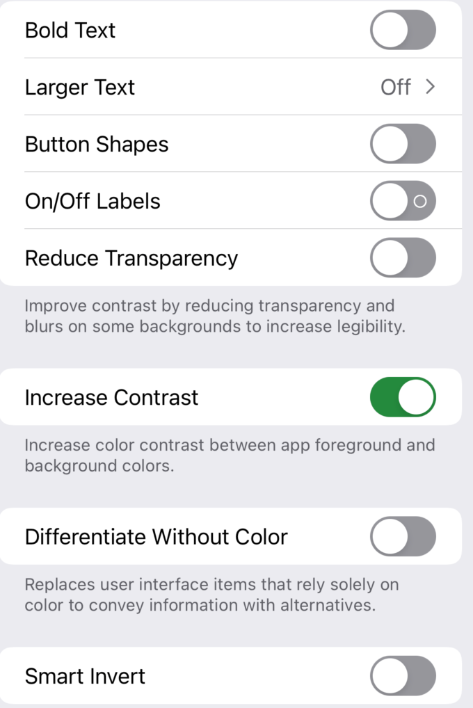
This setting affects all the apps. If your app is not designed to handle changing contrast levels, it might give users an unpleasant experience and will result in a poor app experience.
In the next sections, let's see how you can measure the contrast between two colors and also provide alternate images to fit with high contrast settings.
Color Contrast Calculator to Measure Contrast Between Two Images
You can use Color Contrast Calculator tool in Xcode's Accessibility Inspector to compute contrast between any two colors and use those colors for images used between normal and high-contrast mode.
To open the contrast calculator follow the steps below,
- Open Xcode and Choose
Open Developer Toolsoptions - Select
Accessibility Inspector - In the menu, go to
Window -> Show Color Contrast Calculator
It will open a new window like this,
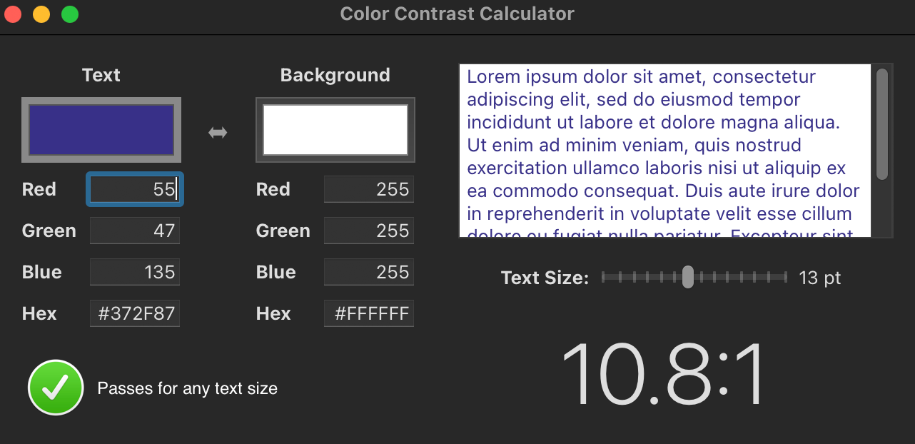
You can choose any two colors you want to compare and the tool will show all the contrast statistics for it. The preview sub-window will show what those two colors look like when put together.
The bottom right-side will show the degree of contrast between these two colors. The larger the number, the better is the contrast. The bottom-left corner will show if the expected contrast level passes for any text size. If there is a visual issue or it does not pass for all text sizes, this space will show warnings or errors based on how severe the issue is.
iOS Built-in Support for Handling Varying Contrast
iOS built-in structure SF Symbols provides an easy way to handle changing system contrast. Since SF Symbols are provided by the system, any time the system contrast changes, the appearance of the SF Symbol image changes too, to match with the current contrast setting.
For example, if I am using built-in SF Symbol images in my app, their appearance will change as I change the system contrast settings.
let imageView = UIImageView(frame: .zero)
imageView.image = UIImage(systemName: "leaf.fill")
And here are two images, the one on the left with normal and the other on the right with the high contrast variant


In summary, if you're using SF Symbols in your app to show images, you don't have to do any changes to accommodate contrast changes. iOS automatically does that for you
How to Customize App with High-Contrast Friendly Images
When you are developing an app with your own images, you can make it contrast-friendly by providing two versions of each image - One for normal contrast and the other for high-contrast settings.
- Go to the project navigator
- Click on
Assets - Add any image you want to add by dragging under Assets
- Once the image is added, go to the Attributes Inspector column and check the High Contrast option
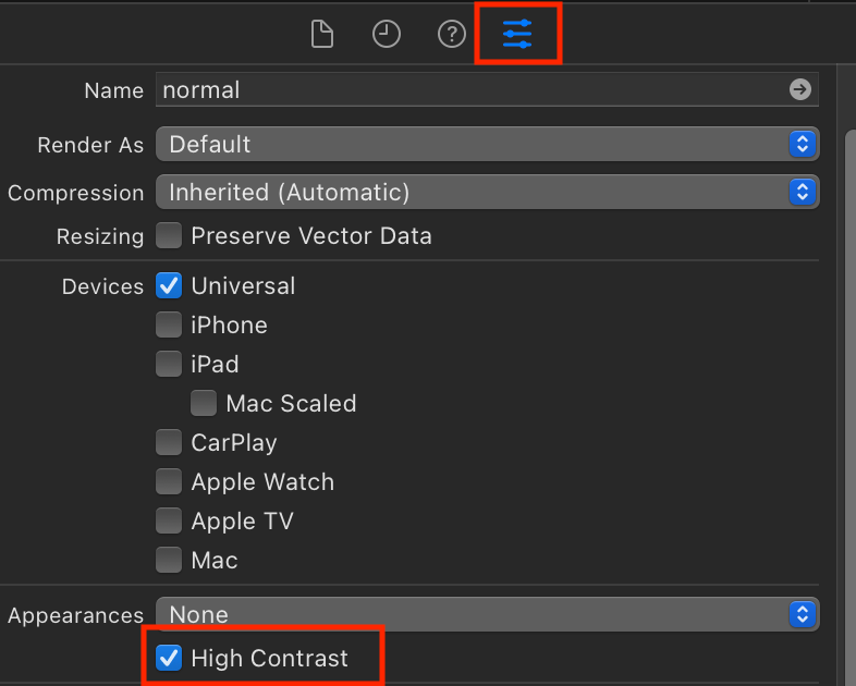
5. Xcode assets section should show one more section to add high-contrast images. You can add the high contrast variant to it.
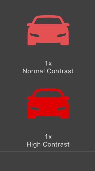
If you run the app and observe the images in normal and high-contrast modes, you should be able to see the difference in side-by-side images,


Summary
When you're building an all-inclusive and accessible app, take a variety of approaches to make it not just visually appealing but also visually accessible for all sorts of users. Colors are a great opportunity to achieve this goal. Some users might also be color-blind. Although iOS doesn't have built-in support to handle this mode, you can customize your app so that users can control which colors they can see in the app without affecting the optimal experience.
Creating high-contrast-friendly apps is just one piece. There are also many ways to make your app visually accessible by leveraging other tools too such as inverting colors, dynamic font support and disabling motions, and excessive animations.
Never assume your default design is accommodating to all the app users. Keep space for users for whom your app may not provide the optimal experience and make changes accordingly before shipping it to end-users.
References